Creating Impactful Designs: Lessons from Top Graphic Designers
Graphic design is an art form that combines creativity, aesthetics, and communication to create visually appealing and impactful designs. Aspiring designers often look up to the top graphic designers in the field to gain inspiration and learn valuable lessons. In this article, we will explore the insights and techniques employed by these renowned designers to create designs that leave a lasting impression.
Understanding the Power of Simplicity
One of the key lessons from top graphic designers is the importance of simplicity in design. While intricate and complex designs may seem impressive, simplicity often holds more power. By stripping away unnecessary elements and focusing on the core message, designers can create designs that are easy to understand and visually appealing.
A prime example of this principle is the iconic Apple logo. Designed by Rob Janoff, the simple apple silhouette with a bite taken out of it has become an instantly recognizable symbol worldwide. Its clean and minimalistic design embodies the essence of the brand and has stood the test of time.
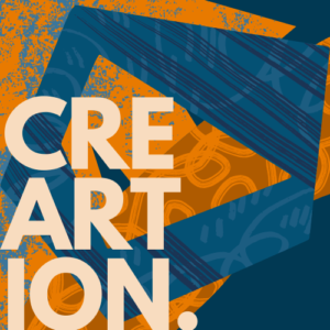
The Role of Typography in Design
Typography plays a crucial role in graphic design as it enhances the visual impact and readability of a design. Top graphic designers understand the power of choosing the right fonts and utilizing them effectively. They experiment with various typefaces, sizes, and styles to create designs that evoke certain emotions and convey the intended message.
For instance, Paula Scher, a renowned graphic designer, often incorporates bold and expressive typography in her works. She believes that typography can transform a design by adding personality and creating a strong visual hierarchy. By carefully selecting fonts that align with the overall design concept, designers can amplify the impact of their creations.
Embracing Negative Space
Negative space, also known as white space, refers to the empty areas surrounding the main elements in a design. This often-overlooked aspect is a powerful tool that top graphic designers utilize to create balance, clarity, and emphasis. By strategically incorporating negative space, designers can guide the viewer’s attention and enhance the overall visual impact.
An excellent example of effective use of negative space is the FedEx logo. Designed by Lindon Leader, the simple yet impactful logo features an arrow formed by the negative space between the “E” and the “X.” This subtle element not only adds visual interest but also conveys the brand’s message of speed and precision.
Experimenting with Colors
Colors play a significant role in evoking emotions and setting the tone of a design. Top graphic designers understand the psychology behind colors and experiment with different color palettes to create impactful designs. They consider factors such as cultural associations, brand identity, and the intended message to make informed color choices.
Take the Coca-Cola logo, for example. The vibrant red color used in the logo is attention-grabbing and associated with energy, passion, and excitement. This color choice aligns perfectly with the brand’s values and helps create a strong visual impact.
FAQs
Q: How can I create impactful designs like top graphic designers?
A: To create impactful designs, start by understanding the power of simplicity. Strip away unnecessary elements and focus on the core message. Experiment with typography to enhance visual impact and readability. Embrace negative space to create balance and guide the viewer’s attention. Lastly, experiment with colors to evoke emotions and set the desired tone.
Q: Can you recommend any resources to learn more about creating impactful designs?
A: Yes, here are a couple of resources you may find helpful:
By studying the work of top graphic designers and implementing their techniques, you can enhance your design skills and create impactful designs that leave a lasting impression.