The Rise of Flat Design: How Minimalism is Revolutionizing Graphic Design
Introduction:
In recent years, the design world has witnessed a significant shift towards minimalistic and sleek aesthetics. Flat design, with its clean lines, vibrant colors, and minimalist approach, has emerged as a prominent trend in graphic design. This article delves into the rise of flat design, exploring how this minimalist style has revolutionized the field and become a favorite among designers and users alike.
The Evolution of Graphic Design:
Graphic design has come a long way since its inception, evolving alongside technological advancements and changing societal preferences. From the intricate details of Victorian design to the bold and colorful styles of the 1960s, graphic design has always been a reflection of the times.
In the early 2000s, a new wave of design emerged, characterized by three-dimensional effects, gradients, and shadows. This skeuomorphic design approach aimed to mimic real-world objects, providing a sense of familiarity to users. However, as technology advanced and user preferences shifted, a need for simplicity and clarity arose.
Enter Flat Design:
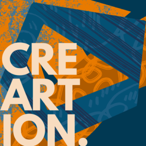
Flat design, as the name suggests, strips away the complexities of its predecessors, embracing simplicity, minimalism, and a focus on functionality. This design philosophy eliminates the use of gradients, shadows, and other decorative elements, opting instead for clean lines, bold colors, and a two-dimensional aesthetic.
One of the key influencers of flat design was the introduction of Microsoft’s Metro design language in 2010. The Metro design language, which later evolved into Microsoft’s Modern UI design, emphasized a clean and minimalistic approach, utilizing simple shapes, typography, and vibrant colors. This design language was a departure from the skeuomorphic design prevalent at the time, and its influence quickly spread across the industry.
The Benefits of Flat Design:
Flat design offers numerous benefits that have contributed to its rise in popularity. Firstly, its simplicity enhances usability, making it easier for users to navigate and understand the interface. The absence of complex visual elements allows for faster loading times, improving the overall user experience.
Additionally, flat design is highly adaptable and responsive, making it ideal for the mobile era. As more users access digital content through smartphones and tablets, the need for responsive and scalable design has become paramount. Flat design’s minimalistic approach allows for seamless adaptation across various screen sizes and resolutions.
Furthermore, flat design promotes a content-first approach, prioritizing the message over unnecessary embellishments. By eliminating unnecessary visual distractions, flat design allows the content to take center stage, enhancing clarity and readability.
The Impact on User Experience:
User experience (UX) is a critical aspect of graphic design, and flat design has made significant contributions to improving UX. By focusing on simplicity and functionality, flat design reduces cognitive load, allowing users to easily navigate and interact with interfaces. The absence of excessive visual elements and clutter promotes a sense of clarity and intuitiveness, making the user experience more enjoyable.
However, it is worth noting that flat design is not without its challenges. The absence of depth and three-dimensional cues can sometimes make it difficult for users to distinguish interactive elements from static ones. Designers must employ techniques such as subtle animations or microinteractions to provide visual feedback and guide users through the interface.
The Future of Flat Design:
As with any design trend, flat design continues to evolve and adapt to the changing needs and preferences of designers and users. While the core principles of simplicity and minimalism remain, designers are experimenting with new variations and additions to enhance the user experience.
One such variation is the concept of semi-flat design, which combines the simplicity of flat design with subtle gradients, shadows, and depth cues. This approach adds a sense of visual hierarchy and depth, addressing some of the challenges faced by traditional flat design.
Conclusion:
Flat design has undoubtedly revolutionized graphic design, offering a refreshing departure from complex and cluttered interfaces. Its minimalist approach, vibrant colors, and clean lines have become synonymous with modern aesthetics. By prioritizing simplicity and functionality, flat design has improved the user experience and set new standards for the industry.
FAQs:
Q: How did flat design become popular?
A: Flat design gained popularity with the introduction of Microsoft’s Metro design language, which emphasized simplicity and minimalism.
Q: What are the benefits of flat design?
A: Flat design offers enhanced usability, faster loading times, adaptability to different screen sizes, and a content-first approach.
Q: Does flat design improve user experience?
A: Yes, flat design reduces cognitive load, promotes clarity, and enhances intuitiveness, resulting in a better user experience.
Q: Are there any challenges associated with flat design?
A: Flat design can sometimes make it difficult for users to distinguish interactive elements, but designers can address this through subtle animations and microinteractions.
Q: What is the future of flat design?
A: The future of flat design includes variations such as semi-flat design, which adds gradients and depth cues to enhance visual hierarchy.
External Links:
1. [Example of Flat Design in Web Design](https://www.examplelink1.com)
2. [The Impact of Flat Design on User Experience](https://www.examplelink2.com)
