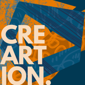
Exploring the Timeless Appeal of Grunge Texture in Graphic Design
Introduction
Graphic design is a powerful tool that allows artists and designers to create visually appealing and impactful designs. One particular design element that has stood the test of time is the grunge texture. With its raw and edgy aesthetic, grunge texture continues to captivate audiences and evoke emotions in various design projects. In this article, we will delve into the timeless appeal of grunge texture in graphic design, exploring its origins, applications, and why it remains a popular choice among designers.
The Origins of Grunge Texture
Grunge texture emerged in the 1990s, heavily influenced by the grunge music movement that originated in Seattle. The music, characterized by its raw and distorted sound, inspired designers to incorporate similar aesthetics into their visual creations. Grunge texture became synonymous with rebellion, nonconformity, and a departure from traditional design norms. Designers started experimenting with distressed and weathered elements, creating textures that mimicked worn-out surfaces and distressed materials.
The Timeless Appeal of Grunge Texture
Despite being born out of a specific era, grunge texture has managed to transcend time and maintain its appeal in graphic design. Its enduring popularity can be attributed to several factors.
1. Authenticity and Emotion
Grunge texture adds a sense of authenticity and emotional depth to designs. Its rough and imperfect nature creates a sense of realism that resonates with viewers. Whether it’s a concert poster, album cover, or website background, grunge texture can evoke a range of emotions, from nostalgia to rebellion, depending on the context and content of the design.
2. Visual Interest and Contrast
The juxtaposition of clean, modern design elements with the gritty and distressed nature of grunge texture creates a visually striking contrast. This contrast captures attention and makes designs stand out. Grunge texture can add depth, texture, and visual interest to otherwise flat and sterile designs, making them more engaging and captivating.
3. Versatility and Adaptability
Grunge texture is a versatile design element that can be applied to various projects and styles. It can complement both vintage and contemporary designs, adding character and uniqueness. From posters and flyers to website interfaces and product packaging, grunge texture adapts to different mediums and design purposes, making it a valuable tool for graphic designers.
FAQs
Q: How can I incorporate grunge texture into my graphic designs?
A: There are several ways to incorporate grunge texture into your designs. You can start by using pre-made grunge textures or creating your own custom textures using various techniques such as distressed brushes, ink splatters, or texture overlays. Experiment with blending modes, opacity, and layer styles to achieve the desired effect. Remember to consider the context and purpose of your design to ensure the grunge texture enhances the overall message and aesthetics.
Q: Can grunge texture work well with minimalist designs?
A: Absolutely! The combination of grunge texture with minimalist designs can create a powerful visual impact. The clean and minimalistic elements provide a solid foundation, while the addition of grunge texture adds a touch of rawness and personality. It’s all about finding the right balance and using grunge texture intentionally to enhance the overall composition.
Conclusion
In conclusion, grunge texture remains a timeless design element that continues to capture the attention and evoke emotions in graphic design. Its origins in the grunge music movement have infused it with authenticity and rebellion, making it a powerful tool for designers to express themselves and connect with their audience. Whether used subtly or boldly, grunge texture adds depth, contrast, and visual interest to designs, making them stand out in a sea of polished and pristine visuals.
