The Psychology of Color in Graphic Design: How it Influences Perception
Graphic design is a powerful tool that can evoke emotions, convey messages, and influence perceptions. One crucial element of graphic design that plays a significant role in shaping these outcomes is color. Colors have the ability to affect our moods, thoughts, and behaviors, making them an essential consideration in any design project. In this article, we will explore the psychology of color in graphic design and delve into how it influences perception.
The Impact of Color on Perception
Color has a profound impact on how we perceive and interpret the world around us. It has the ability to evoke certain emotions and create specific associations in our minds. Designers can strategically utilize color to elicit desired responses from their audience.
For example, warm colors such as red, orange, and yellow often evoke feelings of energy, warmth, and excitement. They can be used to grab attention and create a sense of urgency. On the other hand, cool colors like blue, green, and purple tend to evoke calmness, serenity, and trust. These colors are often employed in healthcare or financial institutions to create a sense of reliability and stability.
Additionally, different cultures and societies may have unique associations with colors. For instance, while white symbolizes purity and innocence in Western cultures, it is associated with mourning and death in some Eastern cultures. Understanding these cultural nuances is crucial for designers working in a global context.
The Role of Color in Branding
In the world of branding, color plays a vital role in shaping the perception of a company or product. Companies carefully select colors to reflect their brand personality and values, aiming to create a strong and memorable visual identity.
For instance, the color red is often associated with energy, passion, and excitement. It is frequently used by fast-food chains like McDonald’s and KFC, as it can stimulate hunger and create a sense of urgency. On the contrary, luxury brands often opt for black or gold to convey sophistication, elegance, and exclusivity.
Consistency in color usage across different touchpoints is essential for establishing a strong brand identity. This includes everything from logos and website design to packaging and marketing materials. When consumers consistently encounter the same colors associated with a brand, it reinforces their perception of the brand’s personality and values.
Color Combinations and Contrast
While individual colors have their own psychological impact, the way colors are combined and contrasted can also significantly influence perception. Color combinations can create harmony, evoke emotions, and guide the viewer’s attention.
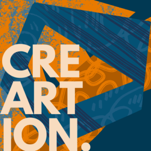
Complementary colors, which are located opposite each other on the color wheel, create a strong contrast and can be used to create visual interest. For example, the combination of blue and orange can create a vibrant and energetic composition. Analogous colors, which are adjacent on the color wheel, create a more harmonious and soothing effect. These color combinations are often used in nature-inspired designs.
Designers should also consider the contrast between text and background colors to ensure readability. High contrast between the text and background improves legibility, while low contrast can make it difficult to read. It is essential to strike a balance between aesthetics and functionality when selecting color combinations.
Frequently Asked Questions (FAQs)
Q: How does color choice impact consumer behavior?
A: Color choice can significantly influence consumer behavior. It can evoke emotions, create associations, and shape perceptions of a product or brand. For example, vibrant and energetic colors may attract attention and encourage impulsive buying behavior, while calming colors can create a sense of trust and reliability.
Q: Can color influence brand recognition?
A: Absolutely! Consistent color usage across brand touchpoints can enhance brand recognition and establish a strong visual identity. When consumers consistently encounter the same colors associated with a brand, it increases their ability to recognize and recall the brand in the future.
Q: Are there cultural differences in color perception?
A: Yes, there are cultural differences in color perception. Different cultures may have unique associations and meanings attached to specific colors. For example, while red symbolizes luck and prosperity in Chinese culture, it represents danger or warning in Western cultures. Designers working in a global context should be mindful of these cultural nuances.
Q: How can color impact website usability?
A: Color can significantly impact website usability. Proper color contrast between text and background is crucial for readability. Additionally, using color strategically to highlight important elements and guide the user’s attention can improve the overall user experience.
Understanding the psychology of color in graphic design is essential for creating impactful and successful designs. By harnessing the power of color, designers can evoke emotions, shape perceptions, and leave a lasting impression on their audience.
For further reading on this topic, check out this article that explores the influence of color in graphic design in greater detail.